7/25/2023
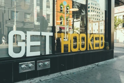
You know what they say -- you never get a second chance to make a first impression. This is just as true for your storefront and branding as it is for meeting with new customers.
So, how can you use the first impression of your storefront to draw in customers, generate buzz and elevate the look of your store?
Is Your Branding Consistent?
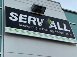
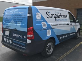
When you're creating window signage for your business, the first thing that you need to consider is how that design connects with your target market and reflects the values, story, and overall message of your branding strategy.
- Your storefront design should be eye-catching and make it easy for customers to understand what products and services you offer.
- Your signage needs to reinforce the branding that you've already worked to create. For example, if you plan to include text on your window decal design, make sure that it's in the same font that you use on your business cards and website.
- Including your logo will make it easier for people to recognize your brand, whether they see your logo on your product packaging, a sign along the road or on your window decal.
- If you've recently undergone a rebranding or have redesigned your logo, ensure that your window signage has been properly updated to reflect those changes.
Is Your Design Legible and Easy to Understand?
Having storefront signage that is clear and easy to read is another crucial element to consider when you're putting together the right design.
Always ensure that people can easily see and read the name of your business and any other text or images you use. You'll need to take a look at your signage from different angles, as well as different distances.
The overall legibility of a design is essential to keep in mind when choosing a font for your design and branding. While an elegant and loopy script might look great up close, it can look like a jumble of lines and letters from further away.
What Kind of Window Signage is Right for Your Storefront?
You also need to think about the overall type of window signage that's right for your storefront.
For example, can you fit all the information you need on a single window pane? Or, would it look better to stretch your design across several consecutive panels?
Are you interested in a frosted effect with vinyl graphics? Or do you want something more temporary that can be easily repositioned or removed? You could also choose perforated vinyl that shows your design as opaque from the outside, yet allows visibility out of your window from the interior.
There are a lot of design options to choose from for your storefront signage, and our team can help you find the right solution! Contact us today to get started on your next project.


