5/25/2023
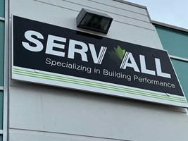
The Americans with Disabilities Act mandates that numerous businesses and other buildings – like offices, schools, restaurants and hotels – adhere to certain regulations when it comes to their signage. But just because these signs are regulated, that doesn’t mean they have to be boring!
You have a lot of creative freedom when it comes to ADA signs that you might not even realize. These signs can be functional and compliant, but without sacrificing style or visual appeal.
How can you make ADA signs more creative?
With the right combination of creativity, attention to detail and adherence to the mandatory ADA guidelines, your business can create a signage and graphics package that goes beyond the basics of compliance.
Consider how your signs can use the following design elements:
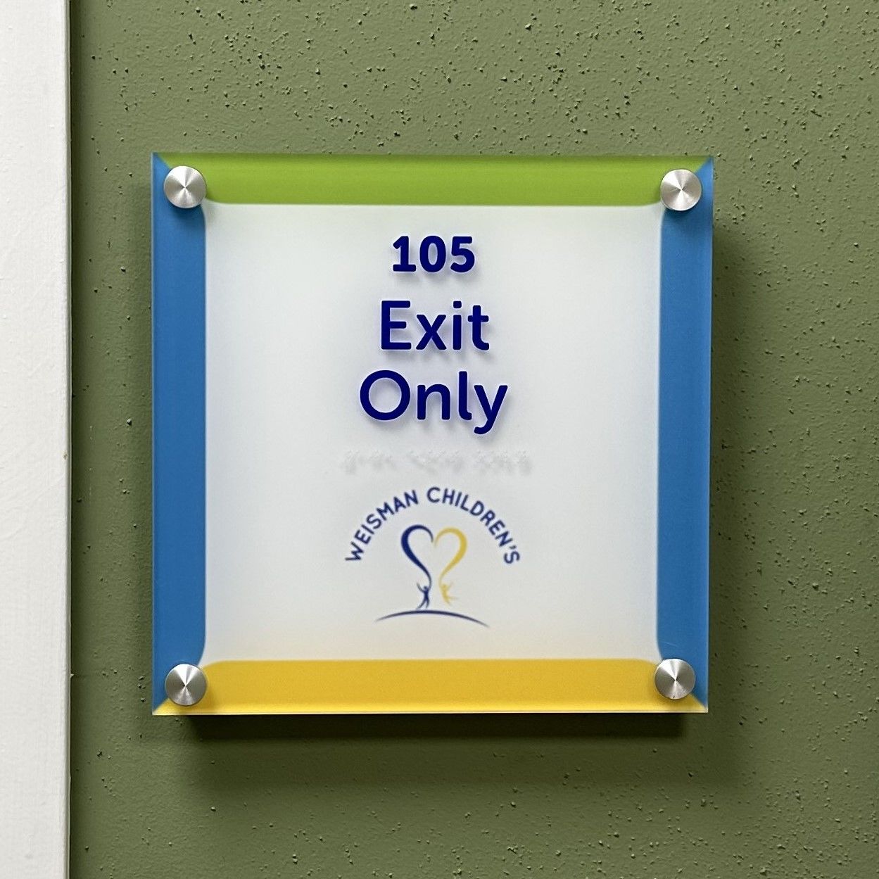 Color: Contrasting color schemes and complimentary hues can be applied to your signs to match or even enhance your company’s existing corporate colors, all while adding to the overall design of ADA signs.
Materials: Think about how you can go above and beyond the standards when it comes to material options. Brushed metal, acrylic and even wood can all be used to create a look that matches a sophisticated, professional atmosphere – or one that invites a sense of whimsy. And they still keep to regulatory mandates while doing so!
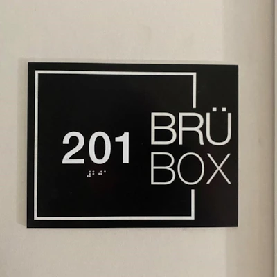
Typography: While certain font styles are still required under ADA regulations, you have the freedom to choose modern, visually-appealing fonts that match your brand standards.
Stylish, functional ADA signs and graphics can go beyond simply promoting and enforcing accessibility for all – but they can also help you visually enhance any space and reinforce your branding! Just because you’re sticking to regulated standards, that doesn’t mean your signs have to bear a standardized look. When you’re ready to take a creative approach to your ADA signs for your building or workspace, contact Image360 Rochester to get started!


