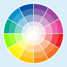
Design elements are an important aspect in creating and maintaining your visual communications. At Image360 Rochester, not only do we handle design production and installation, but our graphic designers are trained professionals who are well-versed in all aspects of visual communication. Here are four important things to consider when working with our team to design your signage and custom graphics:
Visibility
The sign should be sized appropriately for the viewing distance. Generally, you will need an inch of letter height for every 10 feet of viewing distance.
| Letter Height (Inches) |
Distance For Best Impact (feet) |
Maximum Readable Distance (feet) |
| 3" | 30' | 100' |
| 6" | 60' | 200' |
| 9" | 90' | 400' |
| 12" | 120' | 525' |
| 18" | 180' | 750' |
| 24" | 240' | 1000' |
| 36" | 360' | 1500' |
| 48" | 480' | 2000' |
| 60" | 600' | 2500' |
The sign should also be placed in a location with maximum exposure to the target audience. In addition, many forms of visual communication also need to be visible at night. Lighted signage is a perfect solution for night-time viewing, and the solutions vary from electrical and LED signs to digital displays and illuminated cabinets.
Readability
The sign should be organized in a manner that readily conveys its intended message. Readable signs and graphics have key words and phrases that are emphasized with larger letters, bolder typestyles and additional colors. Ideas should be grouped logically and separated by layout and spacing. Graphic elements, especially digital color graphics, can greatly enhance the speed and thoroughness of communications.
Legibility
The sign should be legible and the typestyle selection is critical to the effectiveness of a sign. Sign legibility depends on the proper font to convey the desired image without sacrificing the ability to distinguish individual letters. Many script and specialty typestyles are difficult to read, especially over greater viewing distances.
A high-color contrast factor will improve legibility. Here are the best combinations, ranked in order of legibility from a distance:
| 1 Black on Yellow |
2 White on Black |
3 Yellow on Black |
4 Black on White |
5 Blue on White |
6 White on Blue |
7 Blue on Yellow |
| 8 Yellow on Blue |
9 Green on White |
10 White on Green |
11 Red on White |
12 White on Red |
13 Red on Yellow |
14 Yellow on Red |
Color Combination Effects:
| Contrast | Vibration | Low Visibility | High Visibility |
Noticeability
The sign should incorporate some design elements that will help it stand out conspicuously in the landscape. Color contrast, changeable components, motion, uniqueness of design and/or subconscious attraction can serve to make a sign more noticeable.
Where weak color contrasts exisits, distinctions can be strengthened with an outline or drop shadow.
Ready to take the next step? Schedule a consultation with Image360 by calling 585-272-1234.


